The Story
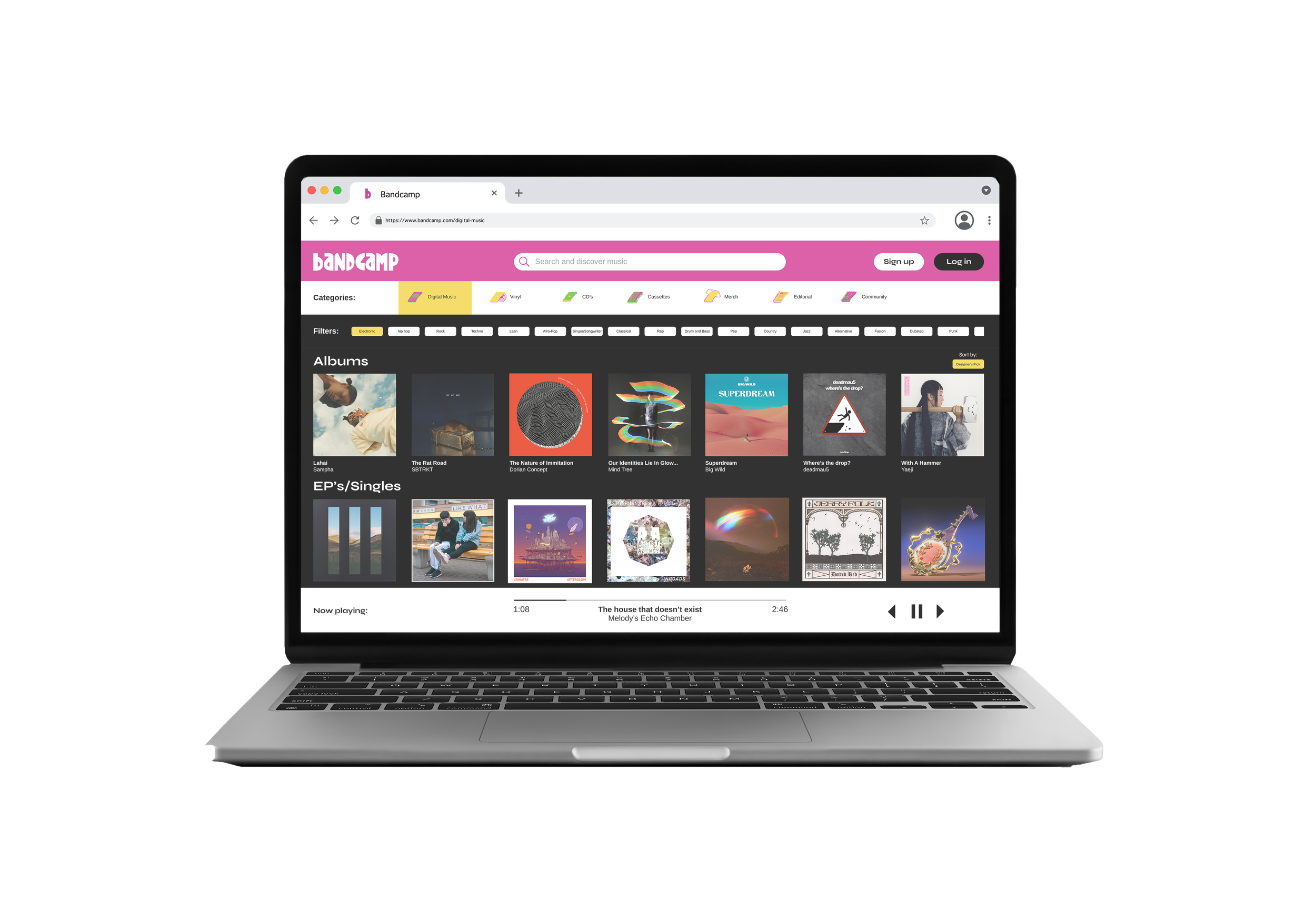
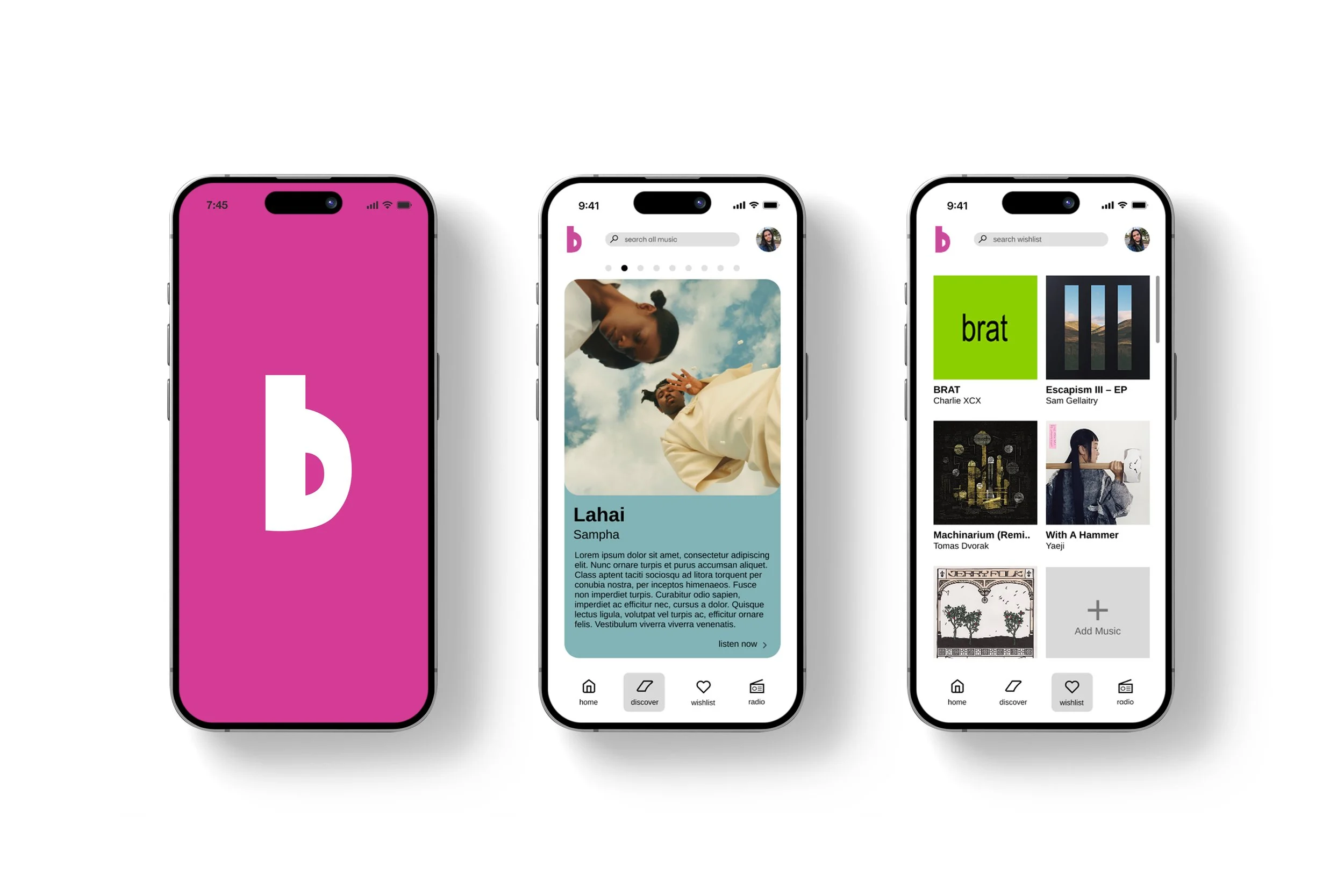
Bandcamp approaches modern music listening from a unique angle, supporting independent artists more than their competitors. In addition to streaming, they promote the purchase of music through digital download, vinyl, CD’s, and various other methods. The company currently holds an audience of music appreciators who use their services to uplift artists and push back against streaming giants in the industry.
The Opportunity
While their business model and values of have been noticed by many, Bandcamp pales in comparison to the most commonly used music streaming platforms. In the rapidly growing world of easily accessible algorithmic music recommendations, the honest conversation about artist revenue is not enough to captivate Gen Z. By instead talking about the unique personal listening experience they offer, Bandcamp can connect with this essential audience.
The Solution
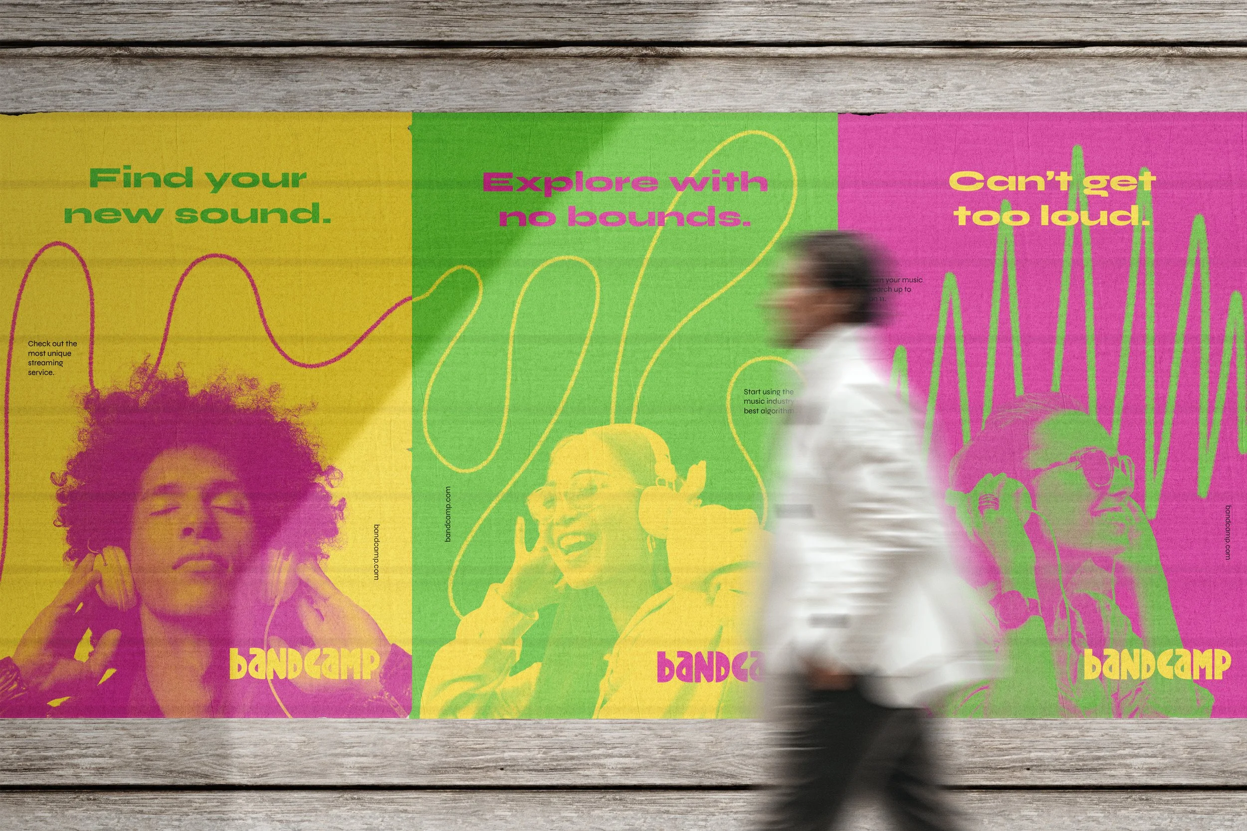
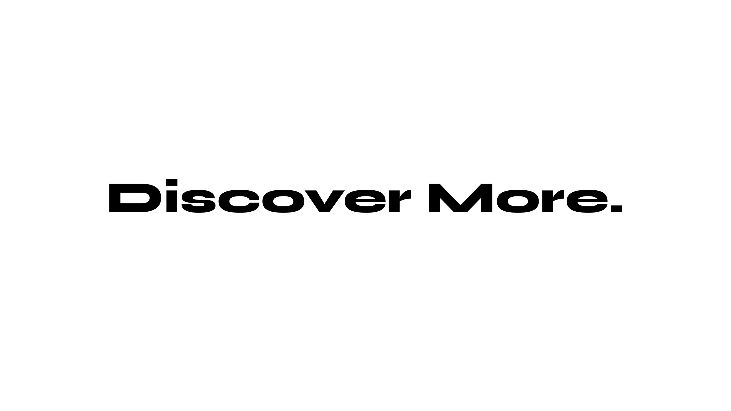
To re-enter the world of music as a standout streaming service, Bandcamp can emphasize its own algorithm. It’s hand-picked selections highlight independent artists that don’t have a chance to be heard on platforms that primarily serve major record labels. This positions Bandcamp as a more exclusive space where no outside factors influence what people can find. The new message can be conveyed with just a few words: On Bandcamp, you Discover More.




Typography
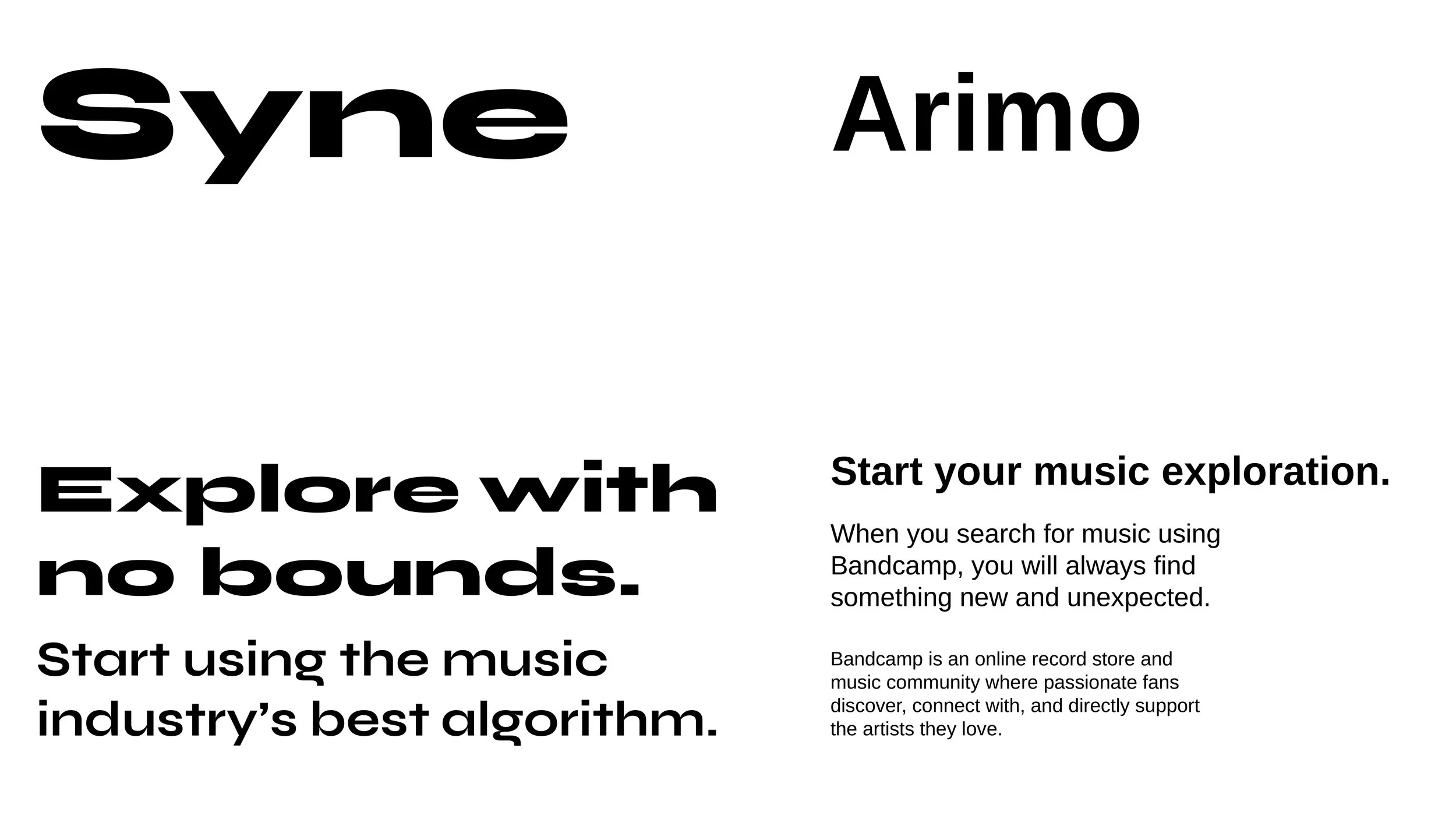
The new Bandcamp uses two primary typefaces. Syne is used as display for large graphics and advertisements. It’s unique form reflects the exploration offered by the company’s algorithm.
Arimo supports the brand by being a simple and legible typeface that pairs well with Syne. It is used on the website, app, and other brand collateral when clarity is top priority.
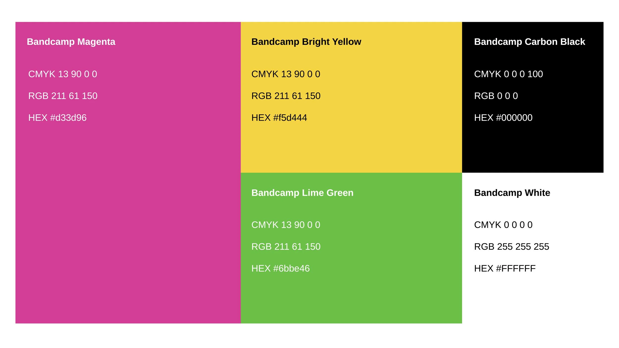
Color Palette
Building up the message of “Discover More,” the new color palette represents many feelings that music can evoke. Brightly balanced hues reflect the spirit of the music industry while establishing Bandcamp as a more unique platform.