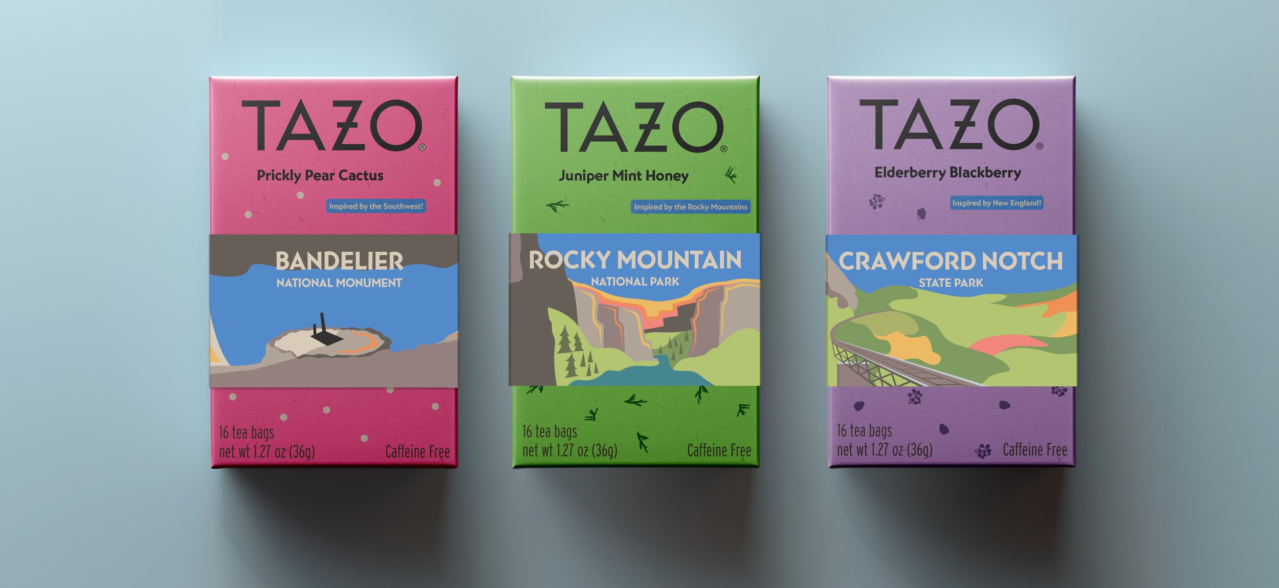
TAZO Tea Packaging Series
The Story
TAZO Tea is a globally recognized tea brand that sits on shelves at almost every major retail market. The company has seen success over many years since 1994, keeping their identity relevant in a rapidly changing market. Most notably, TAZO’s original rustic look was reworked by Starbucks in 2013 to modernize their aesthetic and attract a younger audience of tea drinkers.
The Opportunity
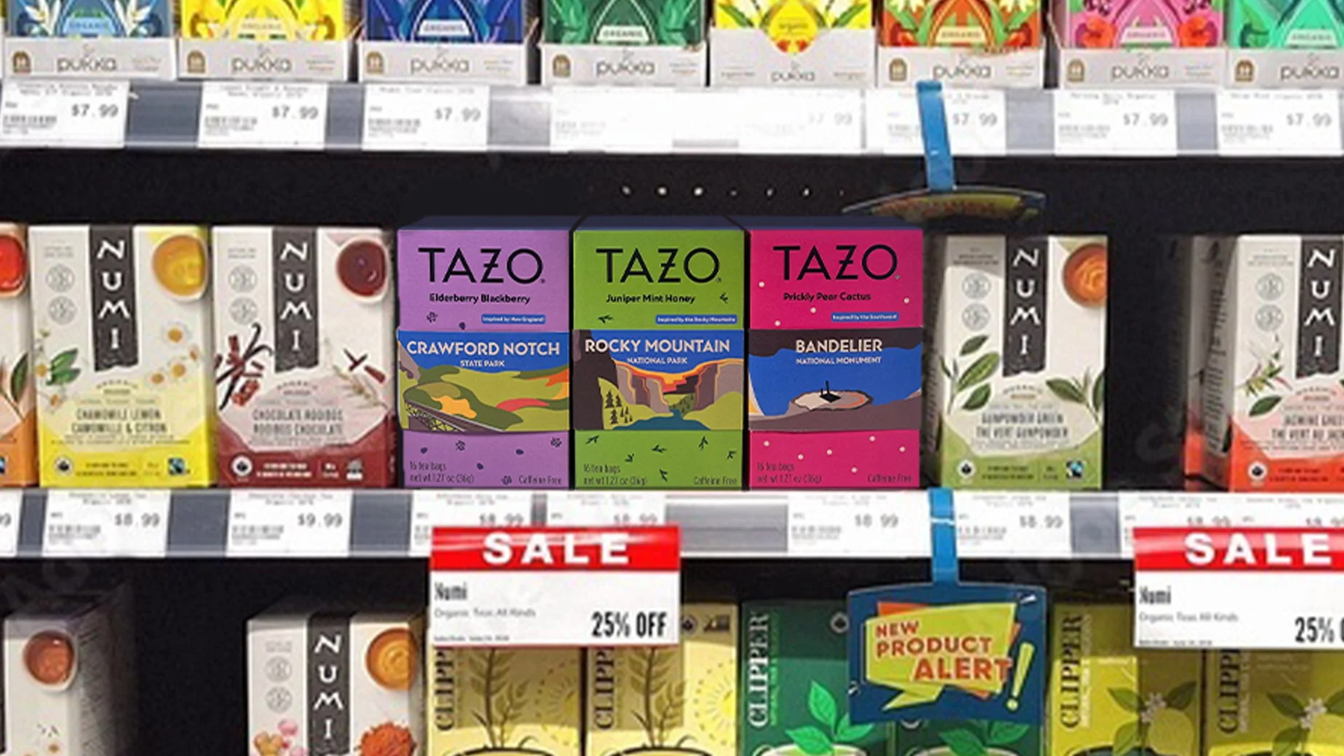
Although the rebrand was a smart choice, there are many positive elements of TAZO’s pre-existing visual identity that got left behind. The mystical, gothic aesthetic exemplified natural ingredients and sustainability—two values close to the company’s mission. Additionally, the younger generation has shifted once again, starting to reject clean and simple brands in favor of ones that are more down-to-earth, whimsical, and artistic.
The Solution
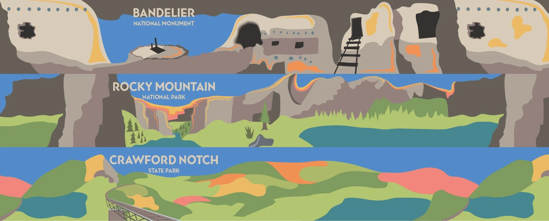
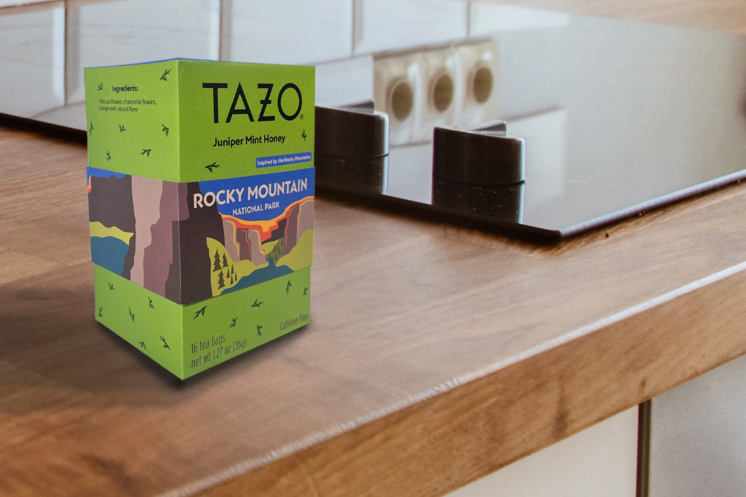
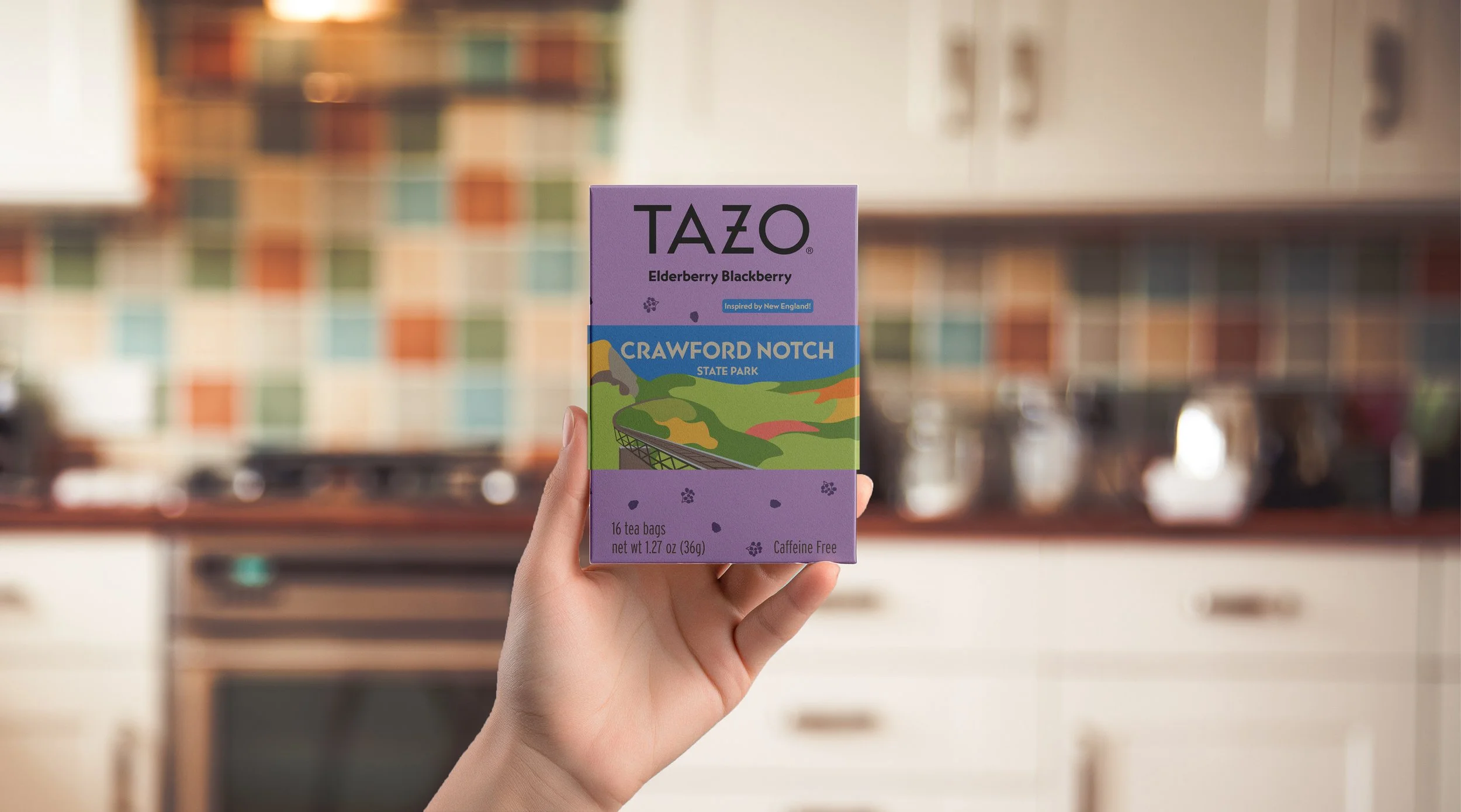
To once again capture this target demographic, this packaging series changes how TAZO visually and conceptually presents their products. It highlights not only the flavors, but also the part of the world they are inspired by, connecting the tea to something more. The custom vector graphics bring the idea to life, projecting emotions that are more exciting and fun than competing brands.



Handmade Graphics
The key element of this design is the band wrapping around each box. Coming straight from sketches, these colorful vector graphics suggest care and attention to detail in the same way that TAZO wants to presents its products. Each illustration depicts a unique area of the world relating to its respective tea flavor, giving customers something more than just a typical experience.